


Can a firefighter help your children in a burning house if he does not arrive safely? Seat belts may be a common, every day occurrence for you – Joe Q. Public, but for firemen, seat belts have bad Vegas odds of being worn during an emergency. Why do you think this is? Aren’t the people who use the Jaws of Life to extricate people from heaps of metal and plastic suppose to practice what they preach? When a fireman is asked about his or her last “cut job” seat belts are often mentioned. Not those of the fireman – the patient’s. Why do we tell others to “wear your seat belt” but in turn do not? To get an answer to that question is like trying to put grease on a goose’s back. Firefighters will always come up with an excuse – “it hinders me coming off the rig; we have lights and sirens we are safe”. My all time favorite – “He who has the most lug nuts will win”. Quiz time – have you seen how many lug nuts a tractor-trailer has? Tradition needs to take heed to common sense in my opinion.

Paul Combs illustrates a safety message for firefighters across the nation to use their seat belts while on fire apparatus. With the growing trend of firefighter deaths in apparatus crashes and rollovers Mr. Combs felt compelled to address this “invincibility” attitude. He created this illustration in 2013. One year prior to this image 17 firefighters were killed in vehicle accidents involving fire apparatus. With those numbers of the “most dangerous job in America” it is sad to report that many deaths do not occur while actually fighting the fire. 25% of the firefighter deaths in America in 2012 were from apparatus crashes. The long-standing attitude of the “invincible” firefighter needed to be addressed. Arriving on the scene and leaving the scene of a fire are not the most glamorous part of the job for a firefighter, but it is arguably the most important. If you do not arrive to the emergency due to an accident or you do not return to the station to respond to another emergency then the public is at risk. The sole reason firefighters do the job is to protect the public from danger. Mr. Combs uses a comic book character, Iron Man, to depict the invincible fireman. Overall the illustration is drawn as a caricature. I believe Mr. Combs effectively addresses the issue of “Superman attitudes” when riding in the apparatus. When a fireman thinks fire is a weaker force than humans then it is time to be slapped with reality. This attitude goes not only for the fire ground scene but also when getting to and from the scene of the emergency.
I believe this illustration appeals to the logos and pathos elements of rhetorical appeals. Mr. Combs does a great job of connecting a safety message with a traditional belief – firefighters are invincible. I mean they run into burning buildings when every one runs out, right? They can save people from twisted up cars, ravaging waters sweeping away citizens, and even stop a hazardous material from leaking, right? This belief that has crossed every firefighter’s mind needed to be addressed one subject matter at a time. Seat belts were a hot issue in 2013 due to the number of deaths. This does not take into count the injuries that occurred and not reported in a fatality report. This is where I believe the pathos element is addressed by this illustration.
As for principles of design for this illustration are concerned -balance, alignment, grouping, consistency, and contrast – Mr. Combs does an excellent job. The balance is centered and equal as if looking through eh windshield of a fire truck. There is a driver on the right aligned with the drawing and a character, Iron Man, on the left. A back seat fireman is leaning from the left into the center of the image as to provide grouping of the typical fire truck assignment. The contrast for this illustration is what draws the attention to the Iron Man character. The firefighter in the back is grayed out to allow your eye to draw to the two characters in the front of the fire truck. This drives the mind to look at Iron Man and associate super powers – inevitably invincibility. The text is written slightly cartoonish but this theme pairs well with the caricature based drawing. Contrasting front seat characters and back seat characters really draws the eye to the color difference. With this visual effect the brain is associating with the Iron Man character. Sizes for this caricature are exaggerated but by nature this is expected. That’s what gives this image a personalization feel. While it may not be segmented the image could be coupled with others to address more safety concerns in the firefighting arena. Mr. Combs takes care of placing the characters in the appropriate and accurate positions of a fire truck.
So do you think firemen are invincible? I am here to tell you they are not. With proper attitude adjustments and safety messages such as these by Mr. Combs, the tide will turn. The fire truck manufactures have taken this “Superman” attitude and hit it head on. Some manufactures are using computer chips in the seat belt clips that disable the truck from being placed into drive until all seat belts are clipped. This is a step forward. Again, if the firefighter does not get to the scene of your fire, he has failed you, himself, and others in his profession.
This is a rhetorical analysis of a cover photo of the April 1993 issue of Fire Engineering magazine. Often controversial, the photo depicts a scene in which a firefighter died while battling a blaze in Denver in 1993. The article subsequently became a starting point for firefighter safety and reversed the stigma of one of the most deadly occupations in the United States.
A thumbnail of the photo with the magazine text removed.
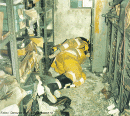 Do you think it’s possible to change an entire work force embedded with years of tradition, with a single click of the camera shutter? The artifact I chose is a magazine cover from the April 1993 issue of Fire Engineering. This cover had a profound effect on the fire service as a whole. The author, David McGrail, drove home his point with little text printed. The title of the magazine is on the top. The photo is of a fireman’s geared up body lying below a window face down in a charred room. Filing cabinets are on the right and shelving is on the left. The cover is neatly balanced with the words “Confined Space Claims Denver Firefighter”. If ever a photo can catch mesmerize a firefighter it would be one that shows a dead fireman. The purpose of the photo, to shock and awe, was fulfilled immensely. This particular fire where Mark Langvardt lost his life morphed into a training evolution that is drilled by thousands of firemen worldwide. While some may think this is an actual picture of Firefighter Langvardt in the position he died, it is not. This is a staged photo to create the conditions Mark faced in that early morning blaze. This “stage” resonates to generations of firefighters and hits at the core. The pathos of this photo is the very emotion that guides fireman daily – fear. Fear of not coming home to loved ones no matter the call. This cover proved to be very effective in a time before social media and the instant Internet. Today there is a drill called the Denver drill that firemen perform yearly.
The photo/cover is arranged neatly and does not have distracting text. The manikin can be seen clearly thus giving the sense it is a real dead fireman. The picture is not over saturated with text, as most magazine covers seem to be today, thus decreasing chances of redundancy. Mr. McGrail did a good job with this stage. The yellow turnout gear, firefighter personal protective gear, has soot on it but not overpowering as to make the gear look unrealistic. With the photo being of a staged scene there is no repeating of colors or patterns. The placement of the manikin is key to the overall gut kick. There is a window above the head of the manikin. Observing a firefighter this close to a window begs you to ask, “Why didn’t he jump out the window?” A valid question is challenged when you notice the height of the windowsill. The size of the room and the height of the window made it nearly impossible to assist Mark out the window that morning. This is evident in the height of the windowsill.
The text type was simple as to not draw attention away from the main draw of the manikin. The size of the text complemented the print of the magazine title at the top. There were no other words on the cover. The image of the manikin placed in the narrowness of the space is centered. The visual effect that is created is effective to make you want to read the article about the line of duty death.
In April of 1993 this article was published to show the firefighting world that death can occur on this job. Prior to this article fireman knew that death is lurking around the corner every time you put on the gear. But everyone avoided talking about it. The photo, while criticized as being inappropriate, got many states to adopt firefighter safety classes and self-rescue techniques.